Why colours shift when you export a video
Here’s a project update I wrote for solving a problem related to representation of colours in Clueso. I’m putting it here, as is. It could be helpful for others who encounter a similar problem.
I read more about colours and was able to extend my understanding. It turns out, resolving this problem requires more time and research, keeping in mind how we handle colours right now, and a recent discovery. It can become a project of its own.
Earlier, I tested with a background and a shape of exactly the same colour. We concluded that the enhanced contrast is expected if the background and shape colours aren’t exactly the same, owing to different colour shifts post-export.
What if the background is an image or a video, and on top of it we have a shape, or maybe any other media? With different formats and encodings, how would colours behave in the final output? It’s the beginning of unpredictability, which requires careful thought and attention.
Before trying to understand the problem, we need to understand how colours behave and how they’re represented. In my last update, I briefly talked about why colour shift happens when images are converted to video. Here, I’ll talk more about colours, and in the end, we’ll understand how this can create more problems for us.
How the human eye handles colour#
Before jumping into representing colours, it’s important to know how our eyes perceive colour.
Our retina contains about 120 million rods, allowing us to perceive brightness, and 5 million cones, allowing us to perceive colour. This means our eyes have evolved to be more sensitive to brightness or luminance than to colours. Did anything click? Last time, I talked about converting RGB images to YUV or YCbCr format for video. There, we kept the luminance information intact but removed some colour data. This is the reason.
Also, YUV data is used for videos because of historical reasons. Earlier TVs were black and white. When colour TVs came, to make old TVs compatible, YUV was a good format. Since it stored luminance data separately, black and white TVs could selectively just use it.
We have separate cones for light with low frequency (red hues), mid frequency (green hues), and high frequencies (blue hues), so we can say our eyes use RGB. But to perceive these colours, we need some light.
Also, our eyes are more sensitive to green colour than to blue or red. This is the reason we can easily detect differences in green shades. This is one of the reasons we encounter problems when dealing with green colour data.
Colours we can see#
To even think about quantifying or identifying colours, we need to first settle on all the colours a human eye can see. How do we identify them, i.e., some sort of tagging and identification? Scientists were able to identify those colours, and for the sake of simplicity, let’s not go into details. Here are the colours an average human can see. This diagram is called the CIE XY Chromaticity Diagram.
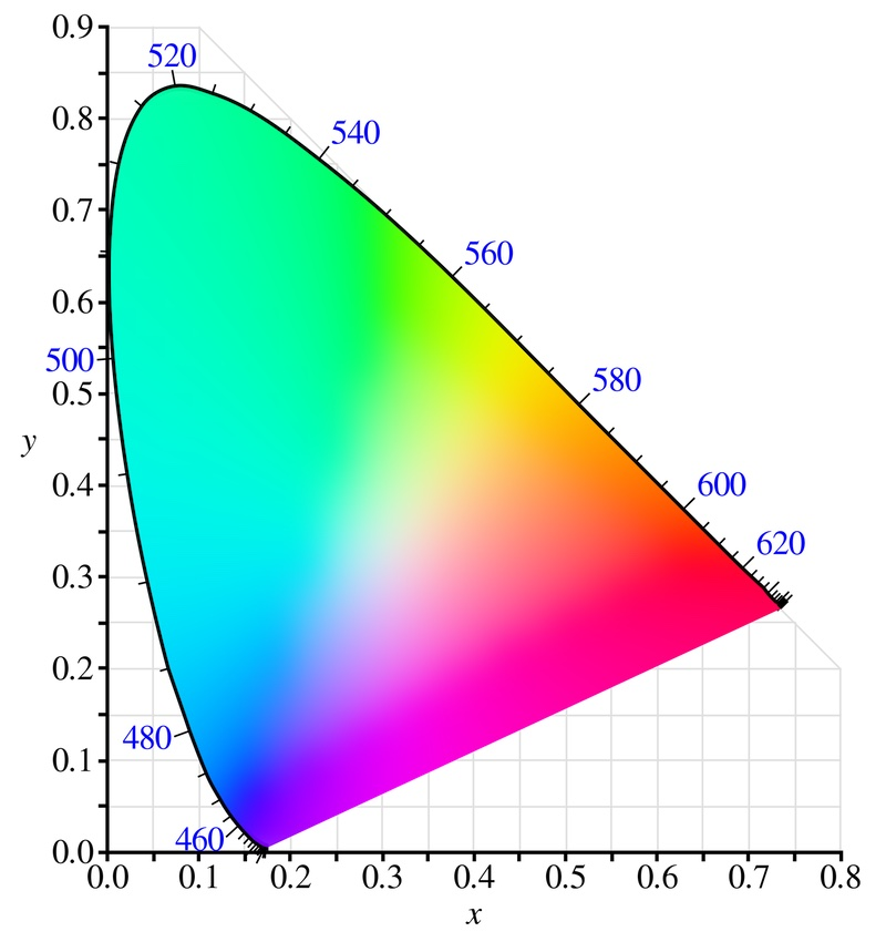
You can think of x and y here as values to identify those colours. These colours are at their maximum luminance. This 2D representation was taken from a 3D space, with x, y, and z coordinates. Don’t confuse them with R, G, and B. Right now, we’re thinking about a standard to identify these colours. We’ll come to the representation part later.
Representing colours#
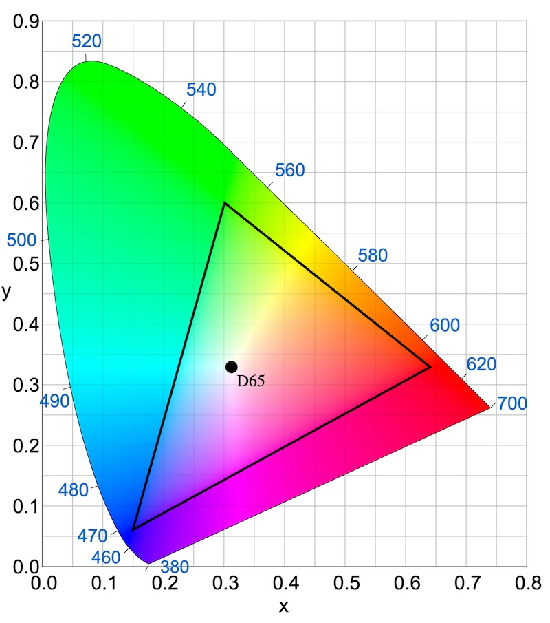
Now that we know all the colours a human eye can see, how can we make them? Most of us are familiar with the RGB concept, i.e., any colour can be made with the combination of red, green, and blue. So, if you look at the above Chromaticity Diagram, you can see we can pick different values of R, G, and B. You can select any 3 points in this diagram for those colours, right? One could say, “We can take the reddest red, greenest green, and bluest blue.” But how do we decide? It turns out, we can pick any combination of these colours. And if you join the three points, a triangle will be formed. You can only make the colours inside the triangle using these three points, which we call primary colours. This triangle is what we call the colour space.
Well, defining 3 colours is not enough. You also have to define the white colour. Since white can look different in different contexts, it can be slightly yellowish, blueish, etc., that’s why we also define it. It’s called the white point. Here, D65 is the 6500K white light.
This triangle here is the Rec. 709 colour space. Different colour spaces cover different colour ranges within the Chromaticity Diagram. All have their own strengths. Displays which can support higher ranges are quite expensive to make. Hence, it’s not common to see displays that cover most of the colours.
You may notice one more thing. If one were to cover all the colours in this diagram, you’d have to take imaginary colours, or points outside this colour area, which our human eye can’t see. Such a display would be really difficult to make.
Now that we can identify colours and we understand colour space, let’s try to understand how we can store and represent colours.
We can choose any colour space, which defines three primary colours and a white point. Generally, 8 bits per colour are used to represent a colour value. This means we can have a 0 to 255 range for each value. We can also use higher bit depths to represent more colours in a colour space.
What an RGB pixel colour means depends on which colour space we use. That’s why the data pertaining to what colour space was used to encode a media file is quite important to decode it properly.
Also, it’s important to note that RGB is one of the models to represent colours. With videos, we generally use Y’CbCr, a modern alternative to YUV, where the luminance value is separately stored. Colour data is represented with two values for blue and red. These three values are used to represent any colour.
Gamma#
Now we understand how colours are represented and stored. But when it comes to actually producing them on monitors, it gets a bit more complicated.
In old monitors, increasing voltage didn’t linearly relate to the brightness they produced. So, for higher brightness, it required disproportionately higher voltage. Storing luminance linearly meant colours would appear darker.
What can we do so that the TV produces the intended colours? We can know this curve for the TV, called the gamma curve, and vary the linear luminance signal according to it. This is one of the ways.
Coincidentally, as we discussed before, our eyes are more sensitive to brightness or darkness than to colours. That’s how we’ve evolved to see in the dark. The curve for this sensitivity to luminance is the opposite of the curve for reproducing brightness in old monitors. What if we use it to our advantage? What if we store relatively more data for darker areas, as it matters the most, and store data with an adjusted curve instead of storing linearly? That way, we can save some data, and the resultant image can automatically look correct on a monitor. That’s what we do.
Modern monitors have a linear relationship to brightness, but still, they mimic the gamma curve behaviour for compatibility.
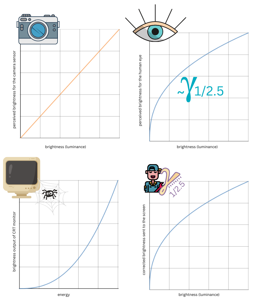
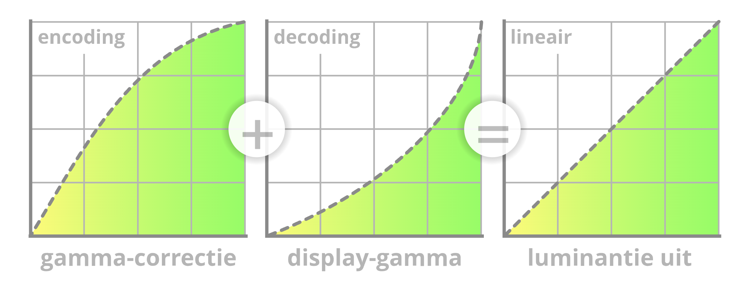
So, the colour space also needs to have this gamma value, as we store data with adjusted gamma.
Converting between colour spaces#
Now we know colours can be represented with different models. RGB is one of the models, mostly used with images. sRGB is a colour space that’s the de facto standard for web environments, that uses the RGB model. Since we use a colour space, we need to know the values of related parameters that we take as a standard, and with reference to those primary colours, we represent other colours within that colour space. To cover more colours in a colour space, we can use different bit depths: 8 or 16 or any custom bit standard. More bits means the possibility of representing more colours. Each colour space has its own gamma value, i.e., the curve that’s used for transforming linear luminance data to an adjusted curve.
A colour space with higher colour coverage doesn’t necessarily mean better quality. If a colour space has a higher area, bit depth starts mattering more, since you’ll have to cover those colours as well for representation. A smaller bit depth would mean not a good transition.
Now, if you were to convert colours from one colour space, A, to another colour space, B, how can we do it? We already have a standard system to identify colours. We’d need to look at how particular colours are represented in A and B. For such transformations, we have some mathematical equations. While doing so, we must also be mindful of gamma conversions. This process is so intricate that it almost always results in some colour shift. Though minimal, it’s there.
Also, what if one converts from a higher colour space to a lower colour space in terms of colour coverage? What will happen to colours that can’t be represented in the new colour space? Also, bit depth also plays a role. What if the colour is present in the new colour space but the bit depth of that space doesn’t allow it to be represented? In such cases, rounding happens. Also, while converting luminance data with gamma transformations, some offset does occur. After all, you can’t always translate each and every detail from one curve to another with 100% precision.
If colour spaces use different colour models, that translation happens too, again with some colour shift.
During this process, we can minimise colour shift, but not eliminate it entirely. This is what I’ve concluded after reading about it.
Why it matters to us?#
Coming back to the unpredictability I was talking about at the beginning of this update: what happens when media files or elements of different colour spaces are imported into our timeline?
Our timeline defaults to a particular colour space. Then, it has to also interpret the colour spaces of imported media correctly. If it wrongly misinterprets them, the user will see different colours while editing than after the export.
Since these media files are from different colour spaces, converting all of them to a single colour space would definitely introduce colour shifts.
We don’t explicitly handle this colour problem right now.
Let’s understand the problem with an example. I followed the following steps:
- Create a new blank project. Change the background colour to green, and export it.
- Create a new project with the previously exported video.
- Add a shape. Fill it with the same colour as the imported video frame. Identify the colour using the colour picker.
- Now the rectangle should be invisible, since the video’s frame and the shape would look like they’re the same colour.
- Export the project.
You’d expect to get a perfectly normal video, where that rectangle shape won’t be visible. But, unfortunately, it’s visible with some contrast. Since we’re more sensitive to green colour, we can easily spot it. Why could this have happened?
Let’s start from the beginning. At step 1, we must be working in a colour space. Let’s call it A. We exported the video with just a background. Colour space conversion must have happened behind the scenes, and the final video was created with colour space B.
In step 2, we imported the video. So, our project uses colour space A, but we imported a video with colour space B. Our timeline might interpret it wrongly, and then it converts it to RGB (browser’s decoder/encoder is used for it) for display. Because of this misinterpretation, it’ll appear different. But we won’t notice it.
Now in step 3, we add a rectangle with a colour fill, matching the colour of the video frame in terms of appearance from our timeline’s perspective.
So, the video clip has colour space B, which is interpreted in a different colour space for display. The timeline has A, and the shape has A.
At step 5, video rendering happens behind the scenes. A frame is extracted from the imported video, which had colour space B. It’s converted to A’s colour space as an image. Note that here a different decoder is used. Every decoder produces slightly different colours. Here, another mistake can happen, if its colour space is not properly identified, further colour issues can occur. This is where the colour changes. The same thing can happen with the shape, depending on whether conversion is happening or not. Since the shape uses the standard colour space, conversion won’t happen.
So now the frame extracted from the video is a different colour than the shape, contrary to what it looked like in the timeline. And after further processing to combine these images into a video, more processing happens, and that’s how you see the contrast between the shape and the background.
Do you see the problem? Dealing with colours properly requires a project in itself. Closing the issue for now. We may have to pick it up as a project later.
@ajinkya Do share your opinion on this problem. @neel Unfortunately, we can’t avoid this problem right now. @pj If clip types have the same colour space, we can get the desired results with the same colour workaround. But if they differ, unfortunately, we can’t do much because of the nature of encoding and decoding of media files. If there’s a clever solution to this problem, it might require more time and research. We might have to go down the rabbit hole.
For more context, here’s an earlier update:
The issue#
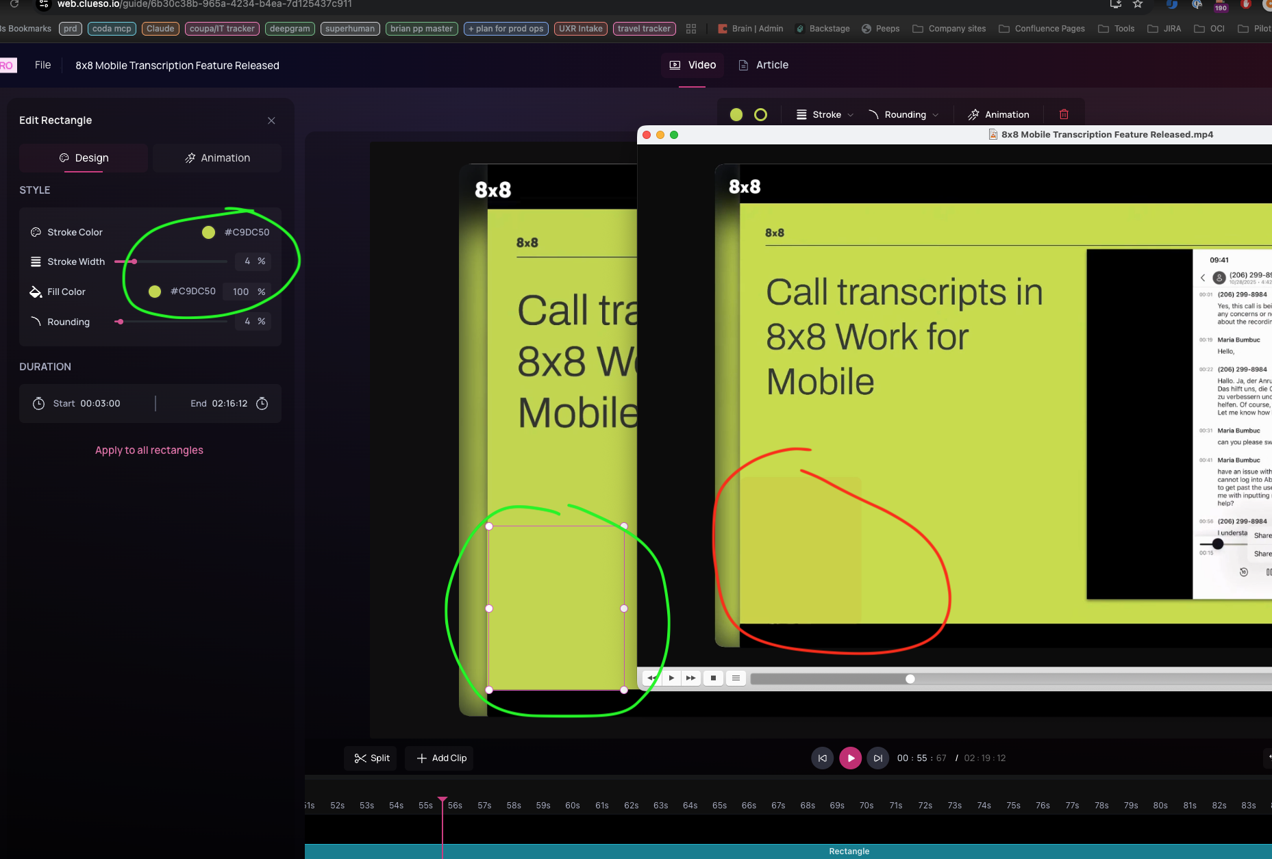
One of the users reported that they exported a video with a rectangle and background of the same colour. But the video output had a colour offset.
They expected the exported video to look exactly the same as the preview, where, the shape was of purportedly same colour as background. However, in exported video, they could see the contrast between background and shape.
My analysis#
Earlier, we hypothesised that the problem might lie in the way the Skia canvas might be creating frames. However, on analysing those generated images, I found that they were perfectly fine. In fact, colours matched exactly to the expected colour codes.
Then I analysed how the video was being created using those generated frames.
We’re using FFmpeg for creating the final output. For doing so, we are providing the following parameters:
				"-c:v libx264",
				"-pix_fmt yuv420p",
				"-r " + fps,
				"-vsync cfr",
Here’s what those parameters mean:
- “-c:v libx264”: H.264 video encoder
- “-pix_fmt yuv420p”: pixel format, YUV color space with 4:2:0 chroma subsampling, planar
- “-r “: frame rate
- “-vsync cfr”: video sync method, Constant Frame Rate
If that’s not clear, here’s what’s happening:
Skia Canvas generates images, with RGB encoding. It’s pixel perfect. But we don’t simply use those frames to create final video by playing them one after another. A lot of processing happens in order to avoid huge file size, and also the way standard video file encoding work.
First, RGB data is converted to YUV data. That “yuv420p” parameter specifies how this conversion happens. In this case, for a pixel grid of 4 by 2, i.e. two rows of four pixels each, for first row, it uses colour data of only two pixels, and makes one copy each. In effect, instead of 4 distinct colour data, it uses only 2. And this row is copied and used to replace the bottom row. That’s what that 0 signifies. Here we lose some colour data. Since our eyes are not very sensitive to slight colour changes, it doesn’t matter much. But our eyes are sensitive to brightness data, i.e. luminance. So, the luminance is preserved for all pixels.
During this process, some colour information is lost because of the following reasons:
- Rounding error while converting RGB to YUV
- Chroma sub-sampling loss
After it, H.264 encoding related compression takes place, which involves:
- Quantisation: Rounding/throwing away the tiny details to save space.
- DCT Artefacts: The ugly glitches you see when too much was thrown away
And then the final MP4 file is produced. Right now we’re not adding metadata like:
- Colour space
- Colour primaries: RGB definition
- Colour TRC: Gamma related parameters
- Colour range
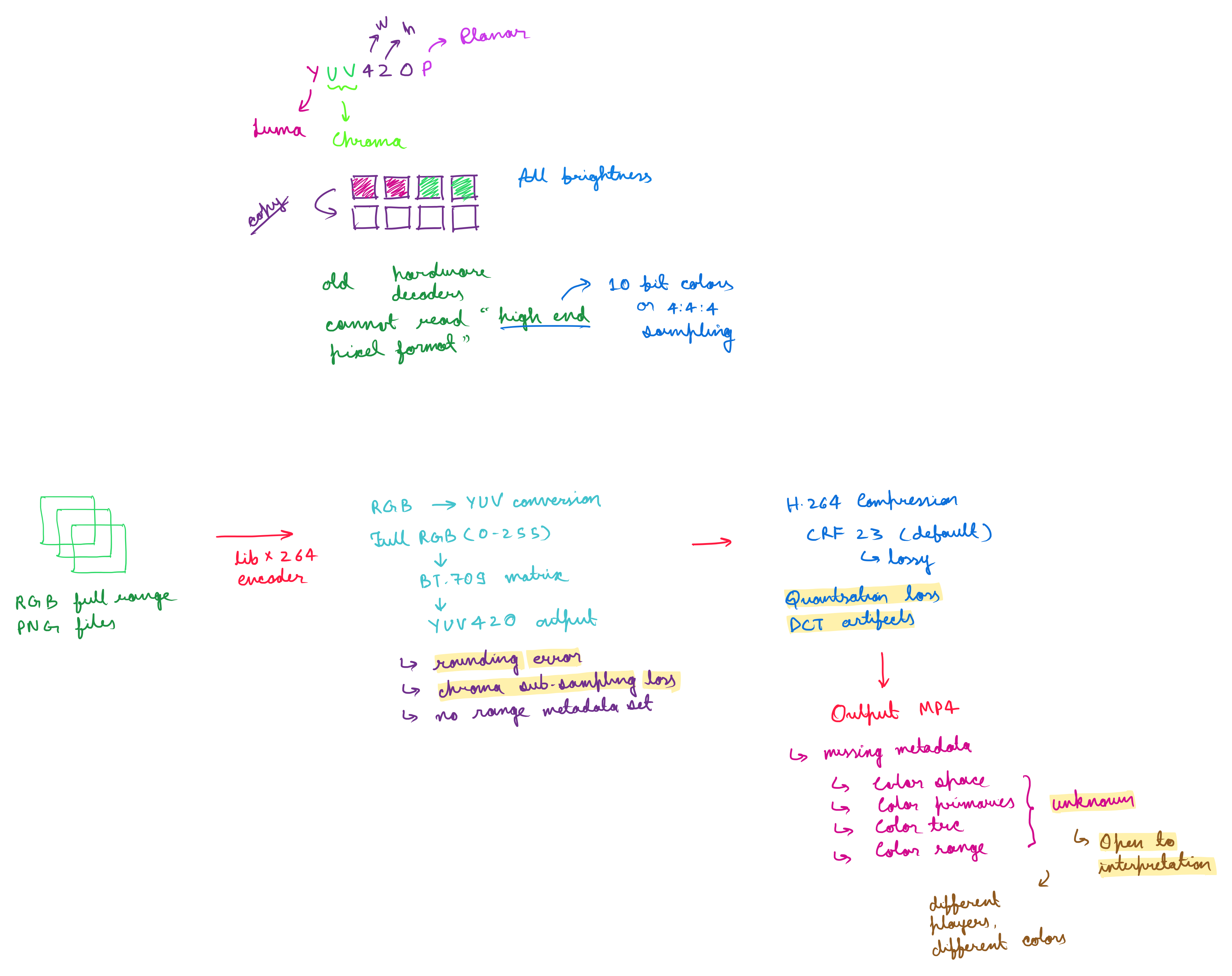
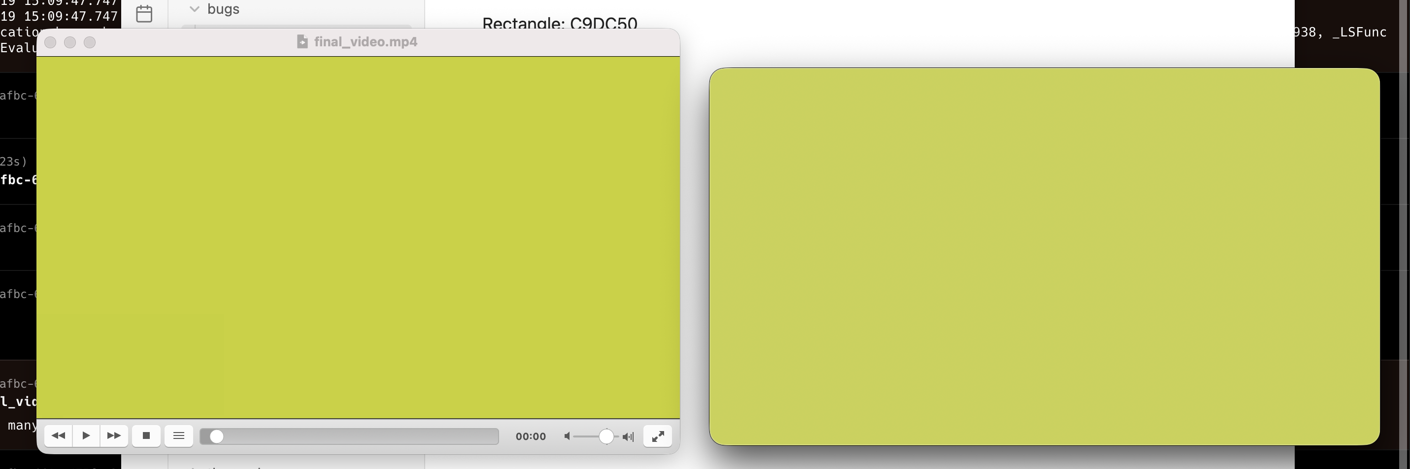
Since this metadata is missing, different players guess these parameters or always assume some standard values. That way, there’s a possibility of misinterpretation of data by video players. That’s why if you open the same video files using different players, it’ll look different.
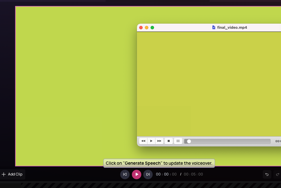
Preview vs output video ⬇︎:
Video on different players, left one is VLC, right one is IINA ⬇︎
Because of all the above reasons, we end up losing colour data. We can minimise this data loss, and reduce the colour shift, but perhaps it’ll be quite difficult to eliminate it completely, because of compression algorithms.
Coming back to the issue, you’d wonder, colour loss is understandable, but why did that rectangle the user pointed out look different from the rest. It’s because, even though the colour of background and shape look the same, they aren’t to begin with.
Rectangle: #C9DC50
Background: #C9DC4F
So, after rendering the video, both colours would have shifted differently, and hence the resultant contrast enhancement.
Had they been exactly the same, user wouldn’t have faced this issue, as colour shifting would have been the same for both the elements.
Coming back to the colour shifting problem, I tried to minimise the resultant colour shift by changing several FFmpeg parameters. I was able to reduce it, but couldn’t eliminate it entirely. Now I’ll be exploring more ways to get the desired results.
After enhancing quality and adding metadata:
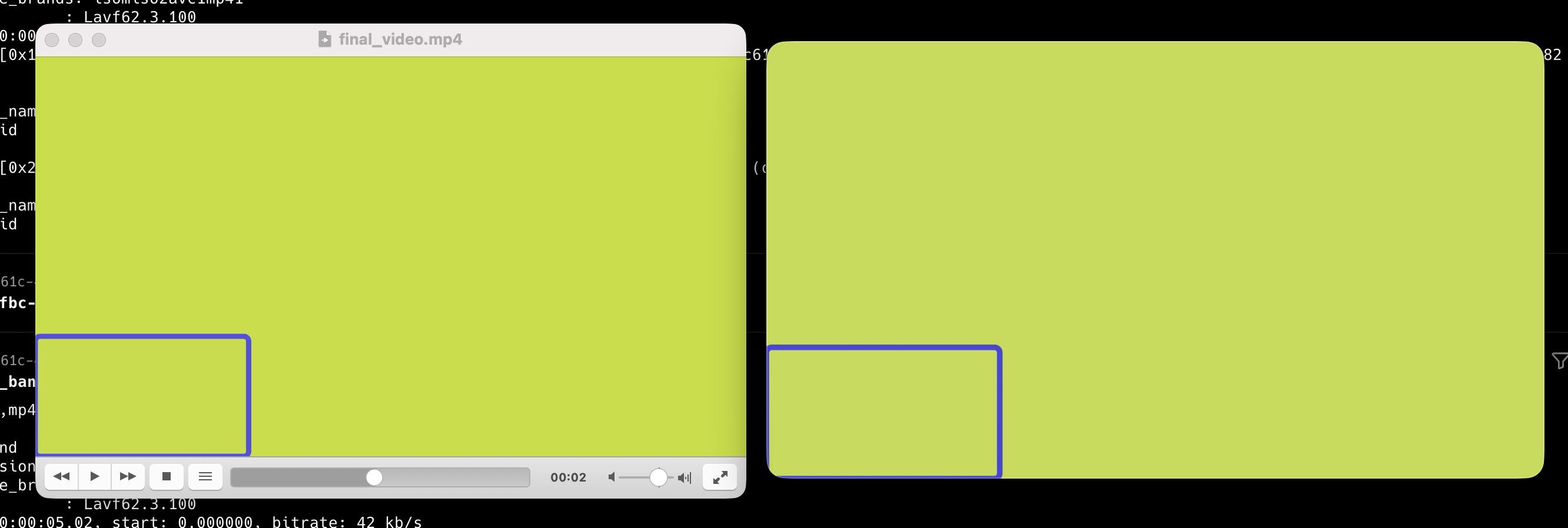
Please ignore that blue boundary. Rectangle has a different colour fill than the background. I wasn’t able to reproduce the exact colour behaviour the user faced i.e. I could notice the contrast but not as much as seen in the user’s screenshot. It can be attributed to reasons including how his system is decoding and presenting the video data on screen, is it taking into account monitor behaviour etc. But we now know the core problem.
I’ll research more on it today. I’ll also work on designing Chrome/web related system to better track and use media files.
Status: In Progress Target date set to Jan 19th Start date set to Jan 16th